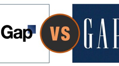
The new GAP logo will probably go down as one of the biggest logo redesigns fails in retail history. Heaven help the executive who thought it was a good idea to change the GAP’s classic logo. Can I get a, “Huh?”
Looking more like the name of a new standardized test than of that classic jean-and-sweater mecca, I’m tempted to bust out a No. 2 pencil and have a teenage-quality panic attack. Not since GAP launched the “Reverse Jean” when I was in high school (wider in the butt, tapered through the calf) was there such an awkward misstep in the chain’s otherwise foolproof formula for staples.
What Does The Internet Think About The New GAP logo?
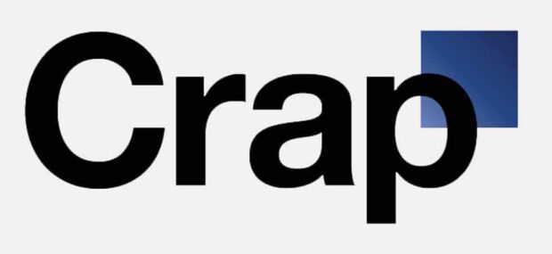
The design blog Kitsune Noir noted: “Where before you had a classic, even if it was an outdated logo, now in its place is something that looks like some kinda’ online bank.” True, true. Twitter pranksters agree and created an account just to mock it.
Finding out you’ve been fired via an @adage article sucks. But corporate says it’s not half as bad as what they’re going to do to Mr. Laird.
— Gap Logo (@GapLogo) October 12, 2010
Love this one: “If I were to tell you the person behind this Twitter account was wearing a Gap polo would you believe me? You’re right, it’s Ralph Lauren.”
Bah! Hopefully, GAP will change their minds. If they don’t, we’d better get used to that strange blue square over the p. Who knows. Maybe in time, I’ll like it. I’ve adjusted to the iPad (and ensuing iMaxi pad), despite my initial “ew” response.
New GAP Logo Gets Mocked By The (Entire) Internet -- #gaplogo #newgaplogo #logodesuign #fails #designfails Share on XCaroline Walker is a Brooklyn-based freelance writer and editor. She has worked in both the entertainment and the nonprofit sector. Walker holds a BA from the University of Southern California and an MA from New York University’s Gallatin School.


 Cigar Guy Steals Spotlight From Tiger Woods At The Ryder Cup And Becomes An Internet Meme
Leave a Reply
You must be logged in to post a comment.