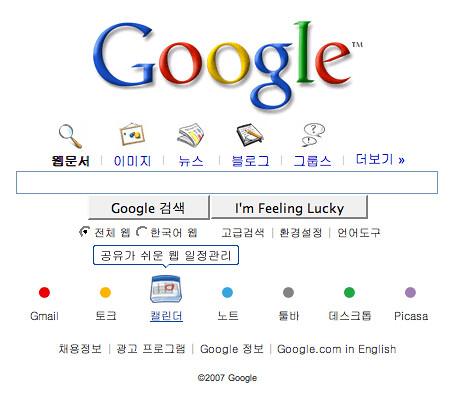
Google has launched a new home page for Korea that departs from Google’s “classic,” minimalist home page approach. The new look features animated product buttons below the search box and will become the default home page in the country, a move Google is comfortable with given the near universal presence of broadband.
The new, animated Google Korea home page is intended to help Google better compete in the country where it seeks to gain market share.

When you roll your mouse over the colored dots, icons appear. You can see the animation on the live Google Korea page.
“It was important where our classic minimalism wasn’t working that we adapt,” Marissa Mayer, Vice President, Search Products & User Experience at Google, said in a briefing earlier today.
Via digg story | methodshop | flickr

Frank Wilson is a retired teacher with over 30 years of combined experience in the education, small business technology, and real estate business. He now blogs as a hobby and spends most days tinkering with old computers. Wilson is passionate about tech, enjoys fishing, and loves drinking beer.


Leave a Reply
You must be logged in to post a comment.