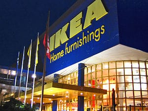
For the past 60 years, the global home products’ retailer IKEA, has used the same(Amazon link) Futura font typeface in all their catalogs and advertising. Futura has been an integral part of the IKEA brand for over half a century. But does anyone really care about a simple font change? Apparently yes.
Font Nerds Are Ready For War After The Latest IKEA Font Change
IKEA’s recent decision to switch to a different font called(Amazon link) Verdana, has IKEA fanatics, design purists, and font nerds everywhere fuming.
Twitter is full of annoyed tweets like…
- “Ikea decided to use Verdana for their print work. I hate that font almost as much as I hate Comic Sans.”
- “Ikea, stop the Verdana madness!”
- “I can’t help but be annoyed over Ikea’s choice to use Verdana as their typeface in PRINT.”
- “Dear Ikea, I miss your Futura ways.”
- “Went to IKEA last night and truely missed Futura. I mean Verdana looks good. But…. Futura just “fit”. Nothing stays the same. #ikea”
- “I do believe that Futura is my new favorite typeface! Damn IKEA for abandoning it!”
Why Did IKEA Switch Fonts From Futura To Verdana?
So why did IKEA make the font switch? Verdana is included in both the Mac and Windows operating systems and allows IKEA to use the same font all over the world. It’s also free, and Futura is not.

Frank Wilson is a retired teacher with over 30 years of combined experience in the education, small business technology, and real estate business. He now blogs as a hobby and spends most days tinkering with old computers. Wilson is passionate about tech, enjoys fishing, and loves drinking beer.


 Yuck! Texas Woman Finds Stranger’s Tooth In Her Milky Way Candy Bar
Leave a Reply
You must be logged in to post a comment.