Table of Contents[Hide][Show]
- Study: Physical Buttons Outperform New Car Touch Screens
- The Car Touch Screen Driver Test Results
- Drivers Hate Car Touch Screens
- What About Hybrid Interfaces That Use Both Touch Screens And Physical Buttons?
- Right Now, Drivers Are Saying “I Hate Car Touch Screens”, But Will They Slowly Begin To Accept Them?
The next generation of automobiles have large touch screens that control every aspect of your driving experience. According to CNBC, 78% of all 2022 model vehicles now have center stack displays in the middle of the dashboard. That right, the physical buttons inside our cars are now mostly gone. Everything from your heated seats to the infotainment system will soon, if it isn’t already, be controlled by a touch screen interface.
But car touch screens require a lot more attention from drivers than physical buttons. This is taking the driver’s attention off the road more often and for longer periods of time. It’s a dangerous situation waiting to happen and many drivers aren’t happy it. So, why are auto manufactures still installing touch screens in cars?
Study: Physical Buttons Are Safer And Easier To Use Than Interactive Car Touch Screens... #CarTouchscreen #DriversDislikes #AutomotiveTechIssues #IncarTechnology #DriversFrustrations #CarTechComplaints #CarTech #DistractedDriving… Share on X“Like it’s crazy that it’s been made illegal to use your phone while driving but auto manufacturers think it’s necessary for me play a game of Bejeweled to turn on the AC.”
Stealsfromhobos
Study: Physical Buttons Outperform New Car Touch Screens
A study by Swedish car magazine Vi Bilägare found that drivers can operate physical knobs and buttons faster than car touch screens. In some cases, it takes drivers 4x longer to complete simple tasks, like changing a radio station, using a touch screen.
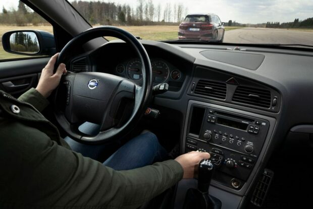
For the study, Vi Bilägare gathered twelve cars at a test track. Eleven of the cars were newer model vehicles with touch screen interfaces. The twelfth car was the “control group” car, an older Volvo V70 from 2005 without a touch screen.
Before the evaluation began, the test drivers all had an opportunity to familiarize themselves with the different dashboard interfaces in the vehicles. The test’s purpose was to measure the time it takes to perform tasks, not if it’s possible to learn a new car interface while driving.
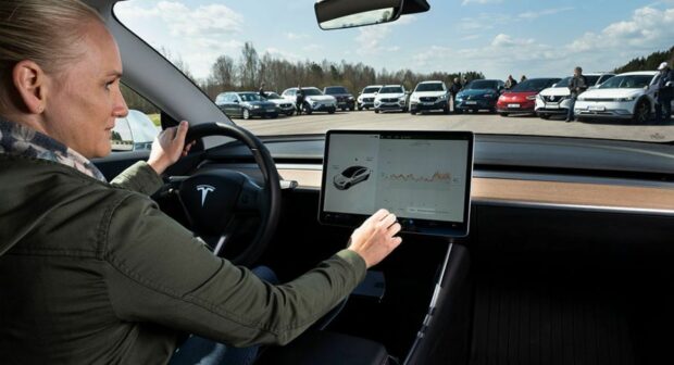
Vi Bilägare then carefully measured the amount of time needed for each driver to execute four common tasks while driving at 110 km/h (68 mph). These tasks included things like adjusting the vehicle’s climate controls or changing radio stations.
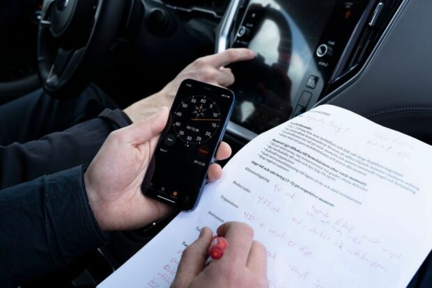
THE DRIVER TESTS
- Reset the car’s trip computer.
- Activate on the heated seat, increase temperature by two, and turn on the defroster.
- Turn off the center display and lower the instrument lighting to the lowest level.
- Select the car’s radio and adjust the FM tuner to a specific channel.
The Car Touch Screen Driver Test Results
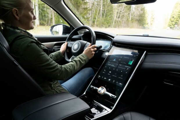
The results of the test show that the car with the worst performance (MG Marvel R) needs over 40 seconds and travels 1,400 meters (4593 feet) to complete the same tasks as the best-performing car (Volvo V70) which only requires 10 seconds and 300 meters (984 feet).
MG Marvel R = WORST- PERFORMING
Volvo V70 (2005) = BEST-PERFORMING
| Car | Time to perform four tasks, seconds | Score, 1–5 |
|---|---|---|
| BMW iX | 30.4 | 4.0 |
| Dacia Sandero | 13.5 | 3.75 |
| Hyundai Ioniq 5 | 26.7 | 3.5 |
| Mercedes GLB | 20.2 | 3.25 |
| MG Marvel R | 44.9 | 2.5 |
| Nissan Qashqai | 25.1 | 4.25 |
| Seat Leon | 29.3 | 3.25 |
| Subaru Outback | 19.4 | 4.0 |
| Tesla Model 3 | 23.5 | 3.75 |
| Volkswagen ID.3 | 25.7 | 2.25 |
| Volvo C40 | 13.7 | 3.5 |
| Volvo V70 (2005) | 10.0 | 4.5 |
Here are some insights from the test results:
- Best Performing Car: The “control group” car, the older Volvo V70 allowed drivers to complete the test tasks within 10 seconds. During that time, the car drove 306 meters at 110 km/h (68 mph).
- Worst Performing Car: According to the test results, the touch screen inside the MG Marvel R was the hardest to use while driving. Test drivers needed 44.6 seconds before the test tasks were completed. In addition to having complicated touch screen menus to navigate, the lower location of the screen forces the driver to completely look away from the road. During the test tasks, the Chinese electric car traveled more than 4x further than the older Volvo V70 (1,372 meters).
- Simple Touch Screen Interfaces Scored Higher: Even though the Volvo C40 has a touch screen, it’s not overloaded with extra menus and features. As a result, test drivers were able to complete their tasks faster in a Volvo C40 than other touch screen cars.
- Complicated Touch Screen Menus Require More Attention From Drivers: The BMW iX and Seat Leon perform better than either of their predecessors, but they are still too complicated for most drivers.
- Viewing Angle: Viewing angles were also measured as part of the test. How many degrees below the horizon did a driver need to look to execute a task? The study found that drivers in poor scoring vehicles, like the MG Marvel R, must lower their gaze up to 56 degrees to view the bottom of the vehicle’s screen. The car with the best viewing angle was the Mercedes GLB, at 20 degrees below the horizon.
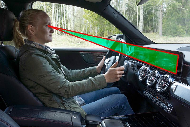
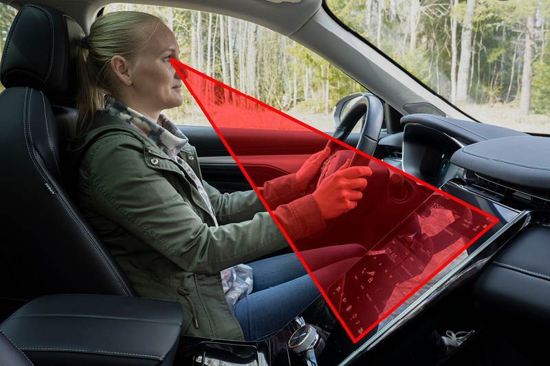
Besides complicated menus and interfaces, the viewing angle was a major factor in delaying drivers from completing the test tasks. The further away the car touch screen was from the windshield, the longer it would take a driver to use the touch screen menus.
Study: Physical Buttons Outperform Car Touch Screens #CarTech #Technology #CarTouchScreens #DistractedDriving @NatlDDCoalition Share on XAre Car Touch Screens Putting Your Life At Risk?

Elon Musk‘s Tesla was one of the first manufacturers to install bigger touchscreens in their vehicles. Without physical buttons, Tesla’s touch screens control a majority of the car’s features. For example, even the Tesla’s windshield wipers are controlled through the touchscreen.
“Half the point of the physical buttons/switches is that you don’t have to look at them while you’re adjusting them, which means you can keep your eyes on the road. Touchscreens in cars are a backwards step masquerading as progress.”
poormansdoorman
But the more time a driver spends navigating car touch screens, the less time they are focused on the road. If you think that this sounds like a potentially dangerous situation, you’re right. Either you or another driver might be busy navigating through complicated touch screen menu options instead of paying attention to the road.
Reddit user just-regular-I-guess had this comment after borrowing their mother’s BMW with a new touch screen interface. “I will say the car has way more settings than mine, but holy shi* it is annoying to go through them while actually trying to, you know, drive. Absolutely nothing is intuitive.”
Touch screens have already proven to be deadly for the US Military. In 2019, the US Navy made the decision to ditch navigation touch screens in favor of physical knobs and buttons after a fatal crash was blamed on touch screen technology. In 2017, 10 sailors died and 58 were injured after the the U.S.S. John S. McCain collided with an oil tanker.
A National Transportation Safety Board investigation of the incident found that the sailors had difficultly using the complicated IBNS (integrated bridge and navigation system) touch screen interface designed by Northrop-Grumman.
Why Are Touch Screens Replacing Physical Buttons In Automobiles?
Almost all new cars have touch screens, even though buttons and switches provide a safer way to operate the vehicle. But why?
Cleaner Dashboard Design
Likely finding inspiration from modern smartphones and tablets, car designers have begun replacing physical interfaces with larger touch screens. Large screens help bring a cleaner design to automotive interiors, but don’t be fooled into believing that this is their primary reason for the change.
Cost Savings
Even though a touch screen is a bigger upfront expense, it creates larger cost savings throughout the car manufacturing process.
Take a moment to think about the different cars that you’ve been inside over the years. How many different knobs, dials, switches, and buttons did they all have? Just imagine the cost to design each one of these physical items and then manufacture, store, distribute, and install them. Instead of stocking physical buttons for years to come, car manufacturers can replace these costs with just a single touch screen.
Revenue Opportunities From App Subscriptions & Promoted Content
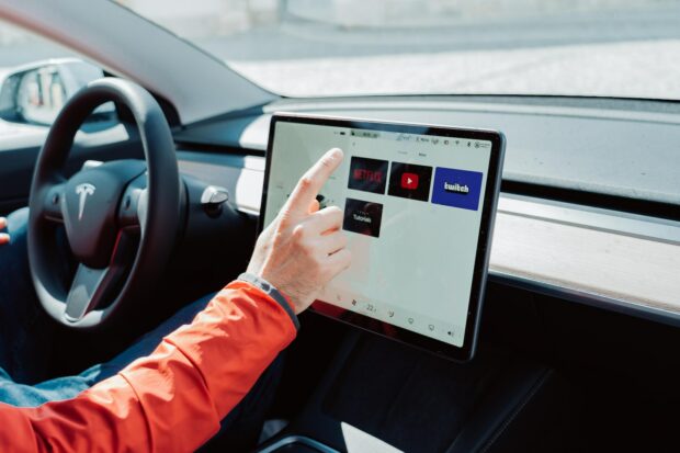
Like anything with an Internet connection, the user is the product. App stores on smartphones and smart TVs have turned subscriptions, advertising, and promoted content into billion dollar businesses. Adding touch screens inside cars gives auto manufacturers a lucrative new revenue stream.
Voice Control Interfaces
When responding to consumer complaints about complicated car touch screens, auto manufactures are quick to shift the conversation to voice commands. In theory, drivers will be able to control most elements of the vehicle using their voice.
However, as we all know from our interactions with Siri and Alexa, voice control systems are not always easy to use. Personally, I struggle just to get Siri to play music that I want to hear in my car. I can only imagine how frustrating it will be to ask Siri to adjust the speed of my windshield wipers
Drivers Hate Car Touch Screens
The Vi Bilägare study and others like it, all provide quantifiable data that prove how inefficient and dangerous touch screens in cars can be to drivers. But what are drivers saying? Do they want physical buttons or touch screens inside vehicles?
Here’s a sample of some of the messages posted by Reddit users commenting on the Vi Bilägare study.
- “Like it’s crazy that it’s been made illegal to use your phone while driving but auto manufacturers think it’s necessary for me play a game of Bejeweled to turn on the AC.” – Stealsfromhobos
- “I absolutely hate the large iPad form that everyone has copied from Tesla. It’s remarkably inefficient and prone to massive failure – if your screen goes off, you’re done…” – mqrocks
- “Live in a cold climate where 3-5 months of the year your wearing big gloves because it’s cold as f**k when you start the vehicle and touch screens are the f**king worst.” – LotharLandru
- “The problem with any touchscreen, no matter how well designed it is, is that you can’t navigate it by touch. With physical buttons I can change radio station, switch from radio to Bluetooth, change temperature, turn on the seat heater, answer the phone, hang up the phone, etc. without ever taking my eyes off the road. It takes a few weeks to learn a new car, but soon it’s intuitive. That’s simply not possible with a touch screen. You have to take your eyes off. Sure, there’s buttons on the steering wheel, but unless you want and insane amount of buttons there, you won’t be completely covered.” – bawng
- “It’s crazy that (auto manufacturers) took a toolset that’s been mostly standardized and highly optimized over the last 75+ years, and decided to replace the majority of it with something that is both objectively harder to use and completely different in every vehicle.” – RiverboatTurner
- “Half the point of the physical buttons/switches is that you don’t have to look at them while you’re adjusting them, which means you can keep your eyes on the road. Touchscreens in cars are a backwards step masquerading as progress.” – poormansdoorman
It’s no wonder that so many drivers say “I hate car touch screens” – they’re simply too easy to distract you from the road.
What About Hybrid Interfaces That Use Both Touch Screens And Physical Buttons?
If touch screens in cars offer more advanced capabilities, but physical buttons are safer and easier to use, doesn’t it make sense to design automobiles with hybrid interfaces? Yes, it does, but it doesn’t mean that system will be easy to use.
For example, the BMW iX has both a big touch screen and physical buttons within the driver’s reach. But it also has one of the most frustrating and complicated user interfaces ever designed. Trying to navigate the BMW’s complicated touch screen infotainment system is so difficult to use that drivers are probably better off just pulling over than risking an accident.
The Volkswagen ID.3 and Seat Leon also have major design flaws. They both have touch-sensitive climate controls below their touch screens that aren’t backlit. At night, these control are difficult to see.
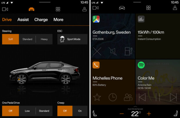
“I consider the Polestar one pretty good,” added Reddit user knorkinator. “(The Polestar) has huge buttons for everything and very shallow and logically laid out menus, requiring minimal effort to find what you’re looking for. It could still use some dedicated climate buttons, but other than that, it’s very well-made.”
Clarifying their types of preferred button functions, Reddit user tribat added, “I would prefer dedicated buttons for the basics like wipers, AC control, volume, windows, etc. Touchscreen for the stuff you’re unlikely to have to do while driving is fine.”
Based on driver feedback, auto manufacturers should consider reintroducing physical buttons into new vehicles. Both qualitative and quantitative data suggests that physical buttons could help save drivers from dangerous distractions.
“I would prefer dedicated buttons for the basics like wipers, AC control, volume, windows, etc. Touchscreen for the stuff you’re unlikely to have to do while driving is fine.”
tribat
Right Now, Drivers Are Saying “I Hate Car Touch Screens”, But Will They Slowly Begin To Accept Them?
One of the initial consumer complaints to the iPhone’s touch screen interface was the lack of a physical keyboard. Because the BlackBerry had a full keyboard, loyal users, including U.S. President Barack Obama, kept their old smartphones long after the iPhone eclipsed the BlackBerry in popularity.
However, all things come to an end. Consumers eventually adapted to large smartphone touch screens and BlackBerry went out of business while Apple posted record profits from iPhone sales. The benefits of apps and larger screens eventually outweighed the comfort of having a physical keyboard.
Will the same thing happen with car touch screens? Will drivers eventually adapt to not having physical buttons in their vehicles? Or will the roads just become increasingly more dangerous as drivers try to fumble through complicated interfaces that take our attention off the road?
What do you think? Would you rather have a touch screen radio interface or physical buttons? What about other car functions?
Drivers Hate Car Touch Screens, So Why Are Auto Manufacturers Still Making Them? ... #AutomotiveTechIssues #IncarTechnology #DriversFrustrations #CarTech #Technology #CarTouchScreens #DistractedDriving @NatlDDCoalition Share on X
Frank Wilson is a retired teacher with over 30 years of combined experience in the education, small business technology, and real estate business. He now blogs as a hobby and spends most days tinkering with old computers. Wilson is passionate about tech, enjoys fishing, and loves drinking beer.






 50 Easy Business Travel Tips To Help Make Work Travel Less Stressful
Ha! I’m a retired computer hardware/software engineer. I’m also a smartphone refusenik – I know what a good computer and a good UI are, the smartphone is neither. So why would I want this garbage in my car?
As a result, I’m “done” with new cars, I’ll just keep my old junk running. Luxury loving Americans are being driven into the poorhouse by multiple $9.99/mo subscriptions, I’ll be darned if I’m going to “subscribe” to ANYTHING in my car.