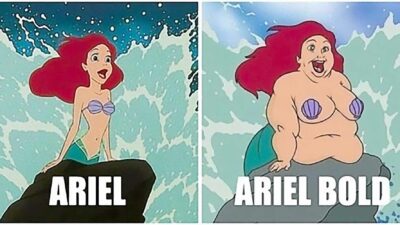
Here’s a little bit of typography humor for all you graphic designers and font nerds out there. People mix up the Arial font with the name Ariel all the time. It’s an understandable mistake. There’s only a one letter difference between Arial and Ariel. But visually, what does the mistake, Ariel Bold vs Arial Bold, look like?
Table of Contents[Hide][Show]
Ariel Bold vs Arial Bold
We all know the Ariel, the character from the Walt Disney film, The Little Mermaid. But do you know her sister Ariel Bold? Like the Arial Bold font, she’s thicker and much bolder in every way.
Ariel Black vs Arial Black
We can’t wait to see Ariel’s other sister, Arial Black. We can only imagine what she might look like. Maybe cartoonist Jeff Swenson will draw us one.


Private investor. Tech enthusiast. Broadcast TV veteran.








 Interview With Stan Lee: The Creator of Spider-Man, Hulk, Fantastic Four, Iron Man, Thor, and X-Men
Leave a Reply