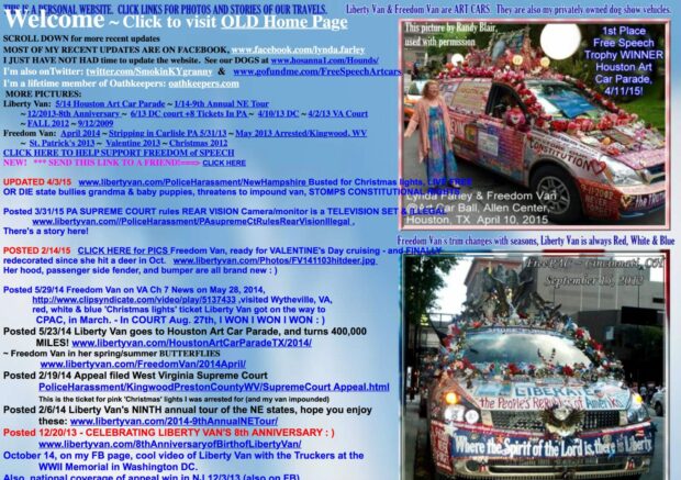
In the late 1990s, it was a common practice to find websites that sucked and share them with friends. Brands like Quaker Oats were routinely ridiculed for their poor site design both online and in books like Web Pages That Suck by Vincent Flanders and Michael Willis. Sadly, those days are mostly over. Decades after the dawn of the World Wide Web, it’s a lot harder to find an example of a really bad website design on the Internet. But we have a bad example of a website to share: LibertyVan.com
Bad Website Design: LibertyVan.com
The Liberty Van website makes us both nostalgic for 1990s bad website design and nauseous at the same time. It almost makes us wish MySpace was still around.
But as bad as the Liberty Van website is now, keep in mind that it was recently “updated”. Although the new site is an incredible improvement over their old website, there’s room for minor improvement.

The Ultimate Bad Website Design Example
Impossible to read, navigate or figure out how it was made, the Liberty Van site will suck you in and could potentially make your eyes bleed. Admittedly, I just spent over an hour exploring it and know more about Liberty Van that I ever needed to. Nevermind, I take it all back. It’s genius marketing. Touché Liberty Van! You win the bad website design award.
Related Articles:
- WordPress Page Builders That Simplify Website Production
- When Was The Last Time You Updated Your WordPress Ping List? (2019)
- Gutenberg Sucks! Here’s How To Disable The WordPress Block Editor
- Famous Works Of Art Photoshopped With Apple Airpods

Frank Wilson is a retired teacher with over 30 years of combined experience in the education, small business technology, and real estate business. He now blogs as a hobby and spends most days tinkering with old computers. Wilson is passionate about tech, enjoys fishing, and loves drinking beer.


 VIDEO: iPhone 6s Destroyed in Hot Molten Lava
Leave a Reply